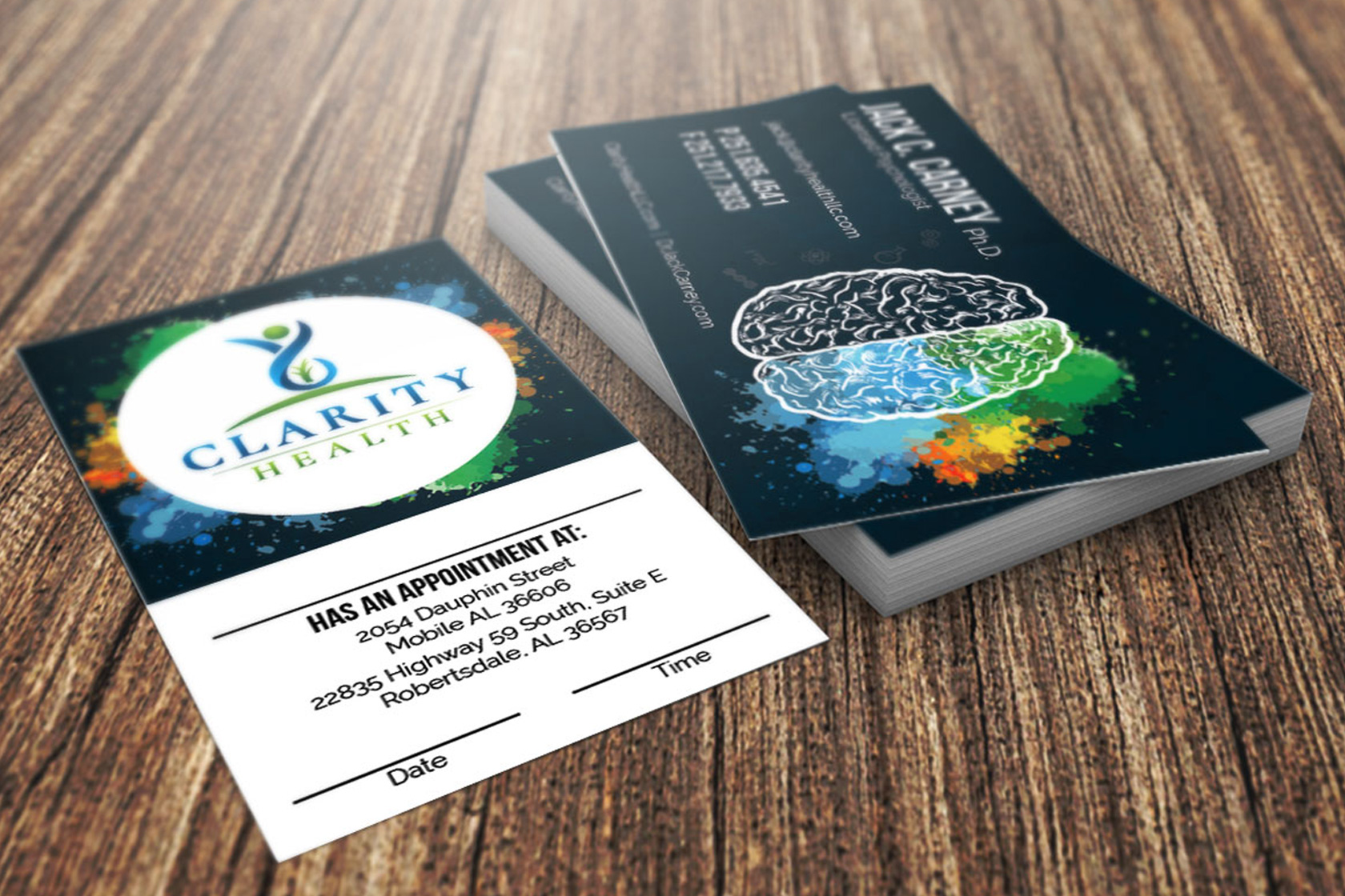
I created a new brand for Clarity Health, LLC that upgraded their look. The client asked for something to do with a brain that demonstrated both the emotional and logical sides. Keeping the brain outlined in a neutral white, I used paint splatters to represent the emotional side and little symbols of double helixes, cogs, beakers, and other scientific elements to represent the logical side.
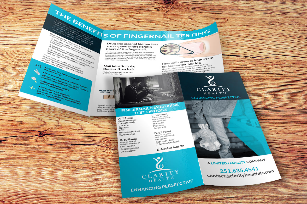
I then designed letterhead, business cards, brochures, and other marketing collateral for them to educate their customers and promote their business.


Copyright © Christopher Gunn Creative. All Rights Reserved.